

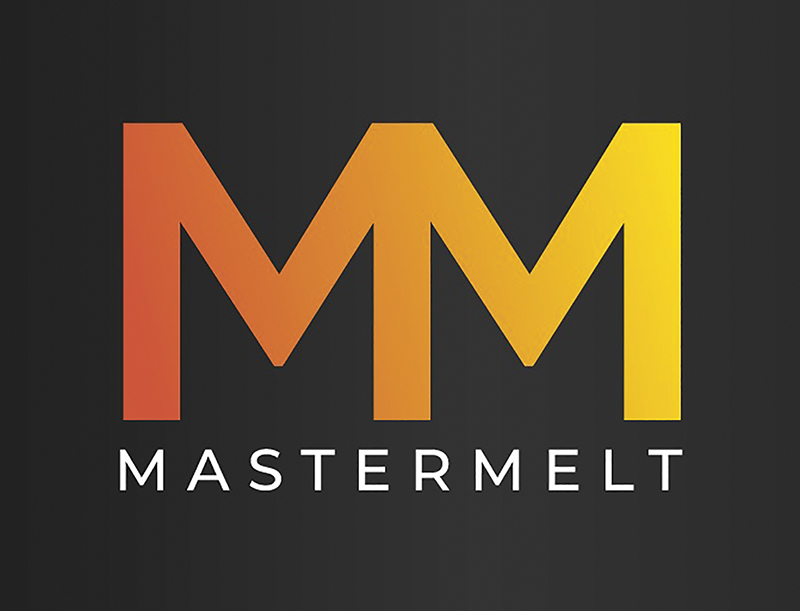
 As Mastermelt’s precious metal reclamation business continues to grow around the globe, the Board of Mastermelt is delighted to announce a new, fresh image for the brand.
Out goes the old, dotted logo and in comes the Mastermelt double M.
Rick Reidinger, CEO, of Master-melt told us, “The new branding represents the fusion of the traditional and modern and symbolises our advanced facilities, personal service and the singularity of our operations. Itis your assurance of our commitment to high standards, innovation and reliability – wherever your material is processed.
On behalf of everyone at Master-melt, we look forward to working with you again very soon.”
More Information:
🌐 https://www.mastermeltgroup.com